

Everyone has a iPhone these days, or an Android device. Mobile phones are so popular that more people are searching google.co.uk or google.com with their mobile device than they are with their desktop computer or laptop. Today, I’m going share how you can leverage that and improve your mobile conversion rate.
1. Responsive Design
So the first thing you need to do is create a responsive design. If you’re not sure what a responsive design is, just check out www.faisalanwar.co.uk .
If you’re on a desktop computer and you minimize the window, like you shrink it, what you’ll notice is, as you shrink it left to right, it’ll get smaller and you can see that the design changes.
So, depending on the device you have, because some people could have a big Samsung Galaxy Note 9 or a small iPhone Xs, you can still have your website visible to them. The last thing you want to do is just create a mobile specific website.
This is because if you create a mobile-only type of website, what happens is everyone who comes to your website on a mobile device, they see certain information. And then, if you update your website for desktop computers, you’re then going to have to go back and update your mobile version. It’s too much work.
You want to have one website for both mobile and desktop users, and even for newer tablet users like the Samsung Fold or Huawei Mate X. Though tablet users are usually grouped in with mobile users.
2. Google’s AMP framework
The second thing that you should consider as well, and this is if you want to go above and beyond, is leverage Google’s AMP framework.
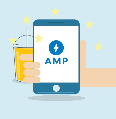
What their AMP framework is, is it makes the website very minimal so it loads extremely fast just for people who are on mobile devices.
The reason this is important is even if someone has 4G or LTE and a really fast web connection, when they’re traveling around, great, your website will load in no time. However, some places don’t have great wifi or don’t have great signal.
For those places, by having an AMP compatible website, your webpages, especially on mobile devices, are going to load extremely fast. Due to that, your user signals and you user experience is going to be higher.
What does this mean? Google will eventually push your webpages higher and higher. They’re pushing this framework so hard that you’ll tell that in the future, people who use AMP are much more likely to rank higher because it’s going to provide better user signals.
3. Sort out Content
The third thing that you need to do is minimize what you show people on mobile devices. So, you have a responsive design now, and let’s say you go to a website like BBC News and you click on an article.
You’ll notice that on their page they have lots going on. They have the content, advertisements and sidebar with all these elements. But if you look at the mobile view (by dragging the window from left to right), you see the content first and you don’t see too much stuff going on.
Why do they do that? Because with mobile devices, if you show users too much stuff it overwhelms them, on especially a small screen, and your conversions will go down.
So what you want to do is, with the responsive design, show the most important elements first, and then put all the other stuff at the bottom. This helps increase mobile conversions.
4. Exit Pop-ups
The fourth thing that you need to do is leverage exit pop-ups. So, on your mobile device, you can actually do it where after someone’s on there for 20 or 30 seconds, you can show them a pop-up.
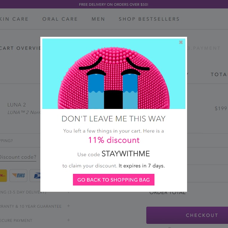
You can show them these pop-ups using Hello Bar, which is a free tool. So, you can create a pop-up within seconds, and do it where after 30 or 40 seconds of someone being on your site on mobile device it shows them a pop-up.
The pop-up on the right is an example of a cart abandonment popup on an eCommerce website.
This won’t hurt your Google rankings because you’re not showing them the pop-up right when they visit your website, but instead, you’re showing it after they’ve engaged. Google will see this and they will not hit you with the mobile penalization penalty.
5. Tap to Call
The fifth strategy that you want to leverage is called Tap To Call. When someone’s on a desktop computer they can’t click your phone number and call you.
On a mobile device, they can tap on your phone number and call you. Most people like making their phone numbers images, so that way it stays all pretty.
That’s the wrong thing you want to do. You want to use Tap To Call HTML. You can make your phone number tapable, so when people put their finger on it, it’ll start ringing and it’ll go to your business.
Bit like I have done with my contact page.
< a href = “+1 929 208 2943” > +1 929 208 2943 < a / >
*remember to take out the spaces
So, in conclusion, if you leverage those five strategies, you will generate more sales from mobile devices.
If you like this article, please don’t forget to share on LinkedIn, Facebook or Twitter.